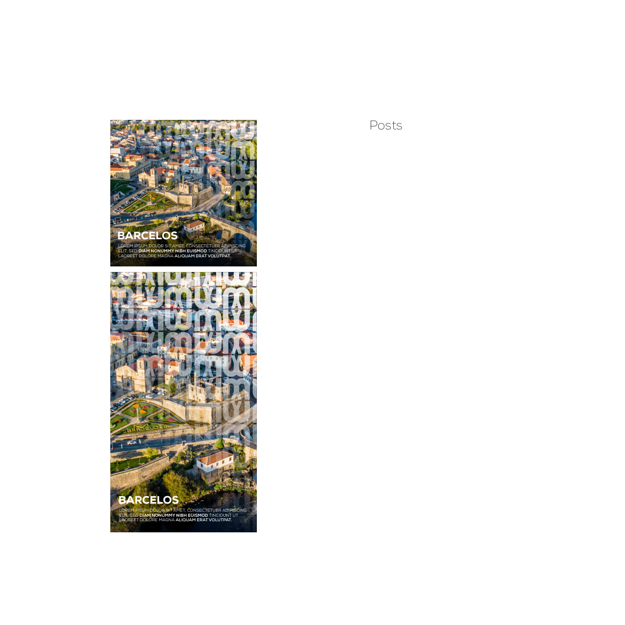
Barcelos Turismo
Brand identity development and graphic standards manual for Barcelos Tourism, inspired by the architecture of the city's iconic medieval bridge.
Project Overview
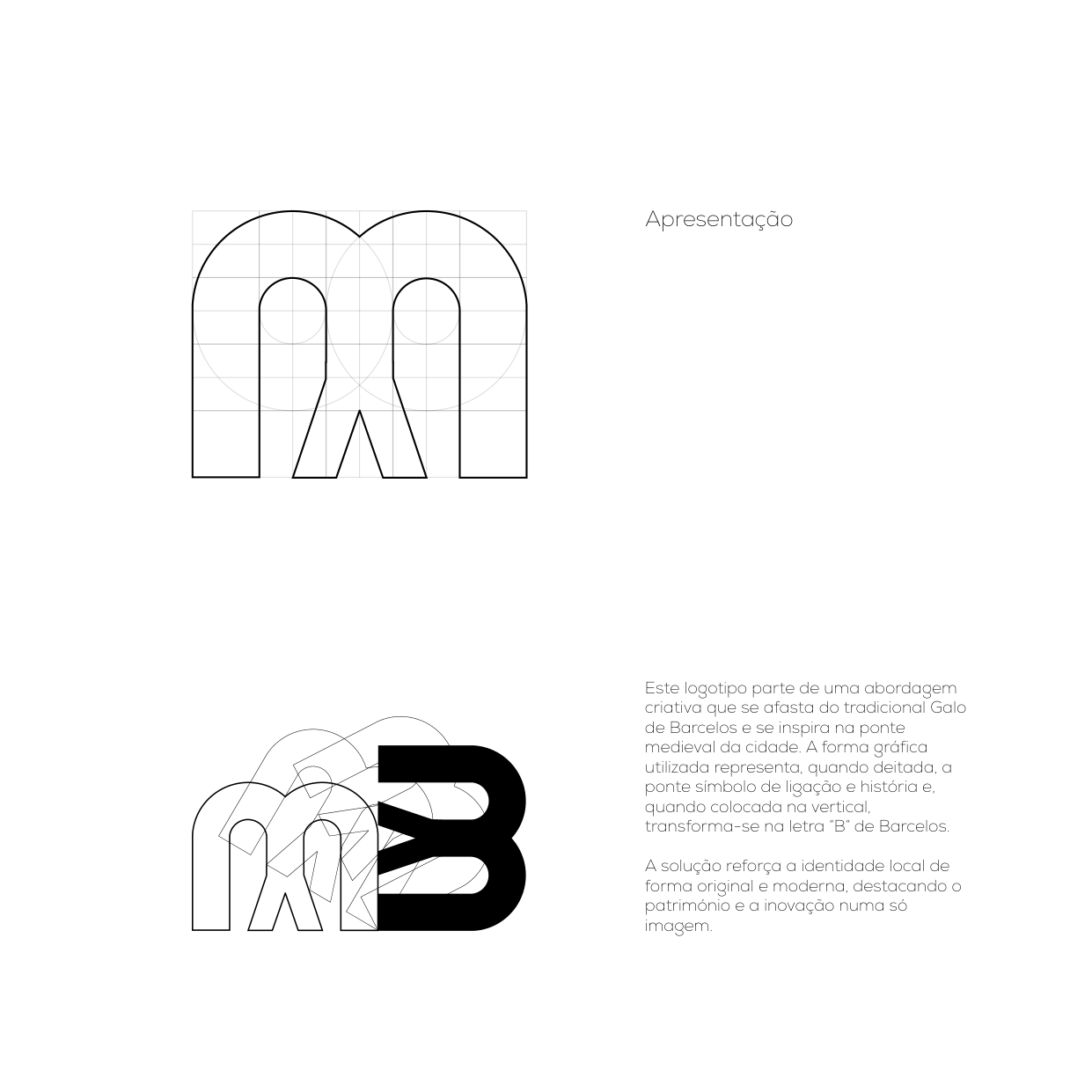
This project focuses on creating a fresh visual identity and graphic standards manual for Barcelos Tourism. The creative concept moves away from the traditional Rooster of Barcelos and draws direct inspiration from the city's historic medieval bridge.
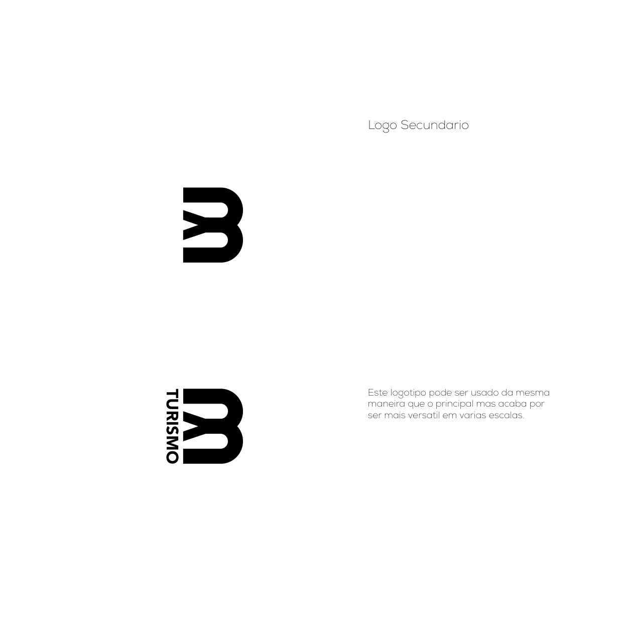
The graphical symbol represents, when placed horizontally, the medieval bridge as a symbol of connection, history, and passage. When oriented vertically, it fluidly transforms into the letter "B" for Barcelos, creating a versatile, modern, and memorable brand identity.
Concept & Applications
The brand identity establishes a cohesive visual language tailored for institutional and promotional media:
- Brand Identity & Logo: Primary and secondary logo variations, geometric construction grid, and clear space rules.
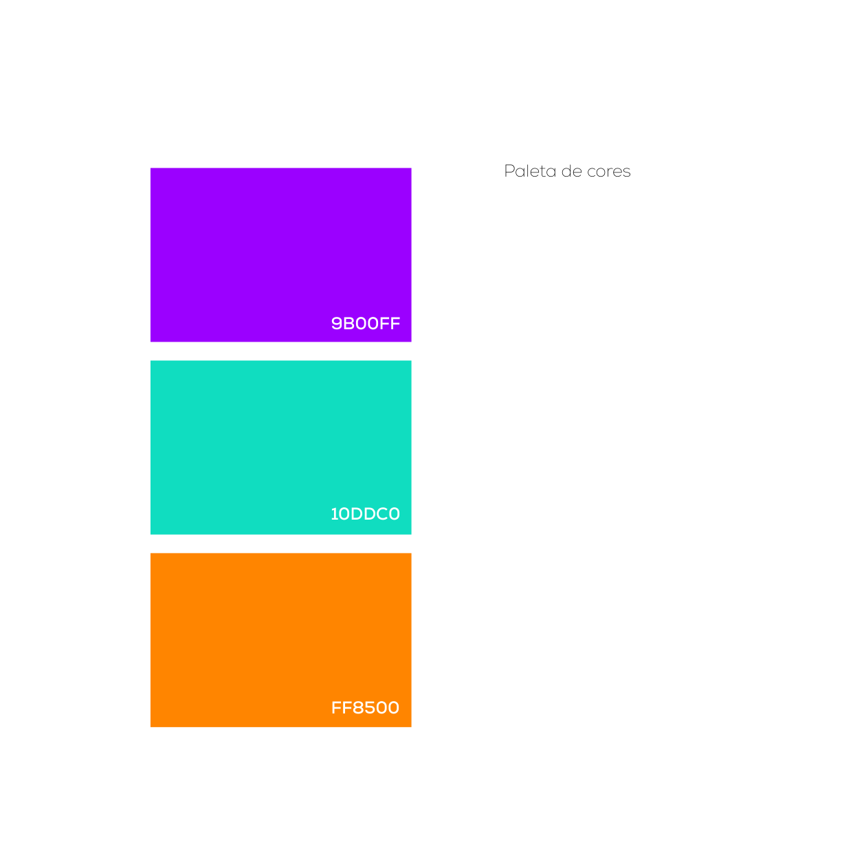
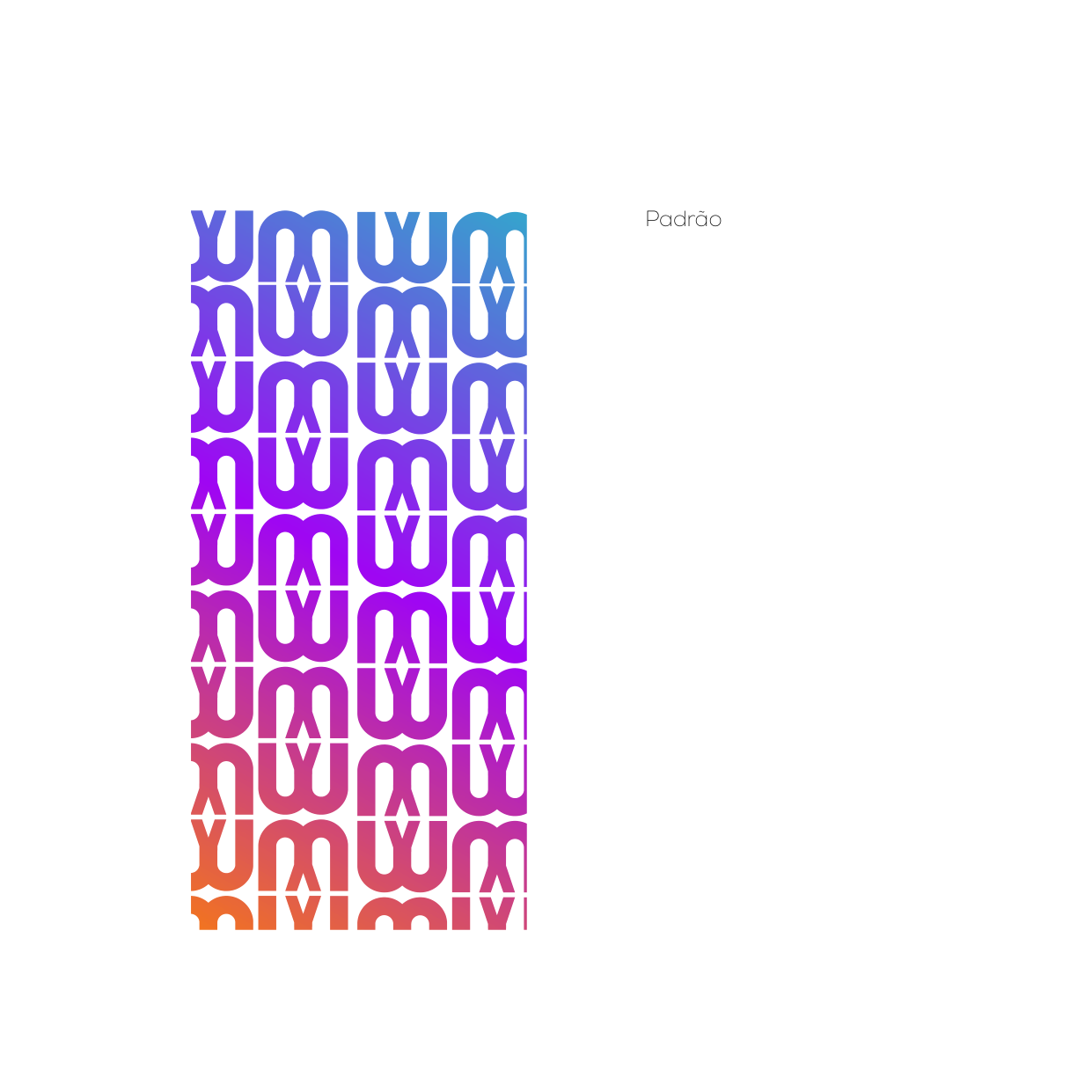
- Color Palette & Patterns: Vibrant brand colors and dynamic repeating pattern systems.
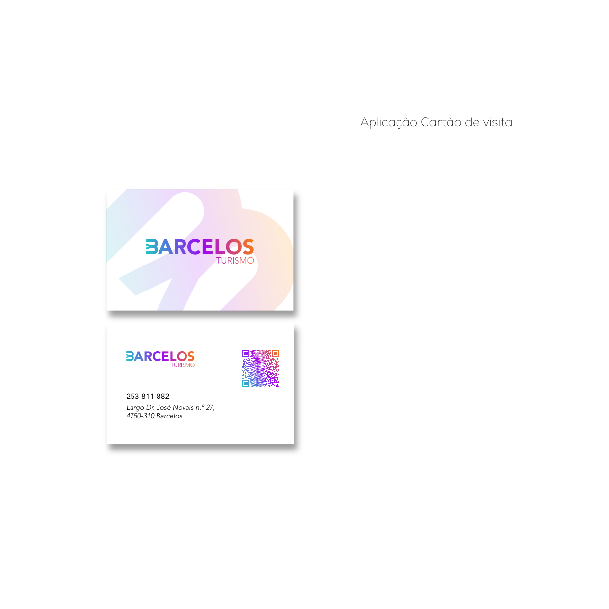
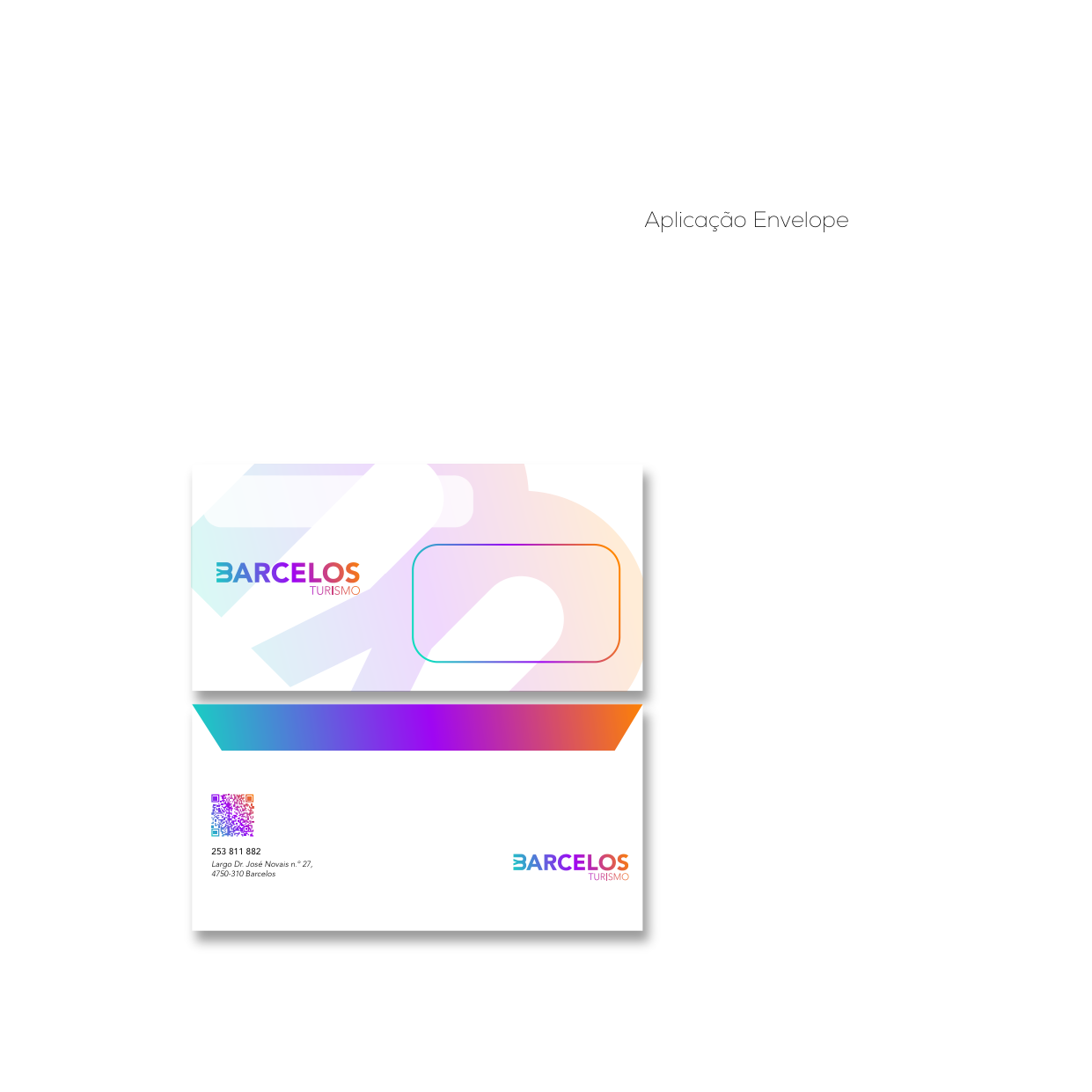
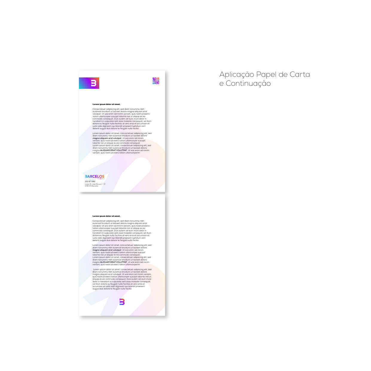
- Stationery & Applications: Business cards, message cards, envelopes, and letterheads.
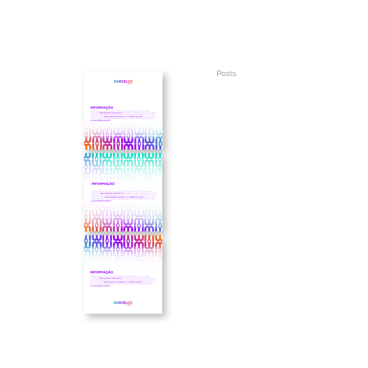
- Digital & Editorial Media: Professional email signatures and social media content templates.
Identity & Logo System
Graphic concept of the medieval bridge, construction of the "B" symbol, and brand color palette.
Stationery & Digital Media
Business cards, envelopes, letterheads, and social media communications.